We’d love to hear from you — whether you have a project in mind, or just want to say hi.
vincent@nust.agency

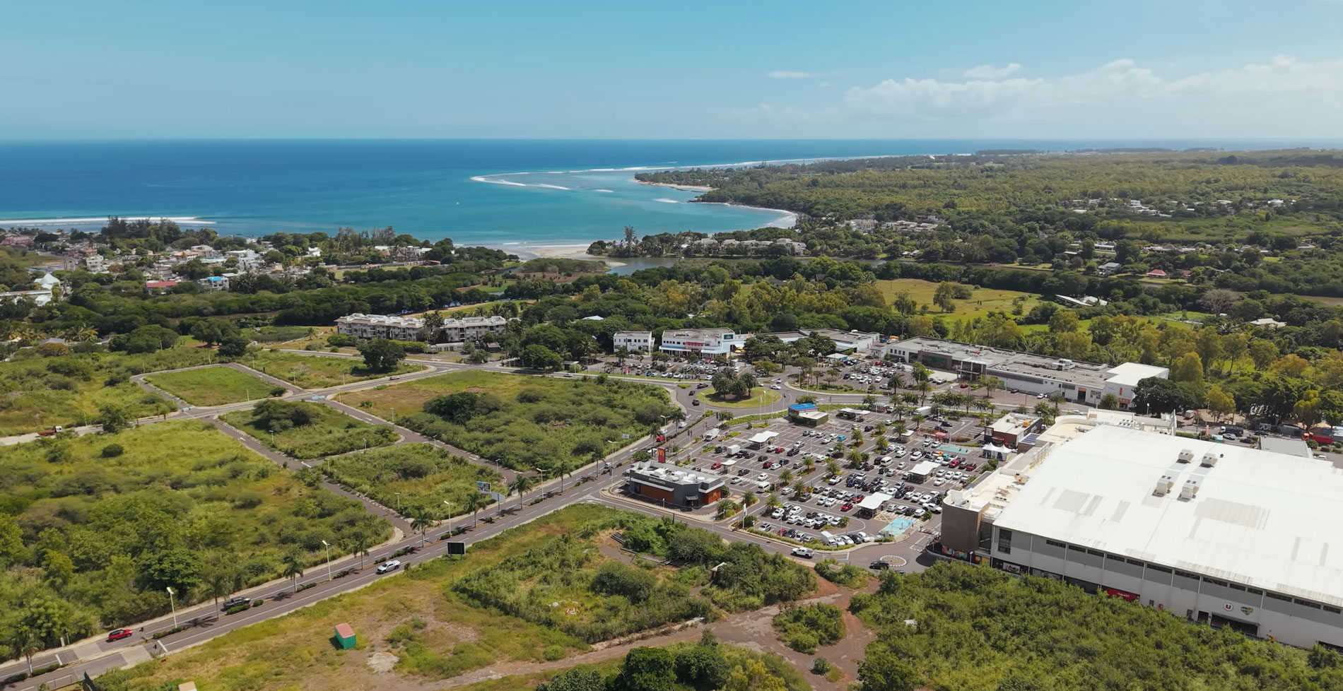
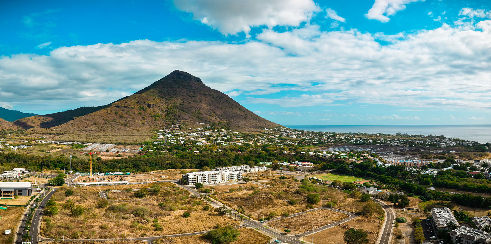
In 2023, Cap Tamarin — one of the largest real estate developments in Mauritius — invited agencies and freelancers to pitch a marketing strategy aimed at repositioning the brand.
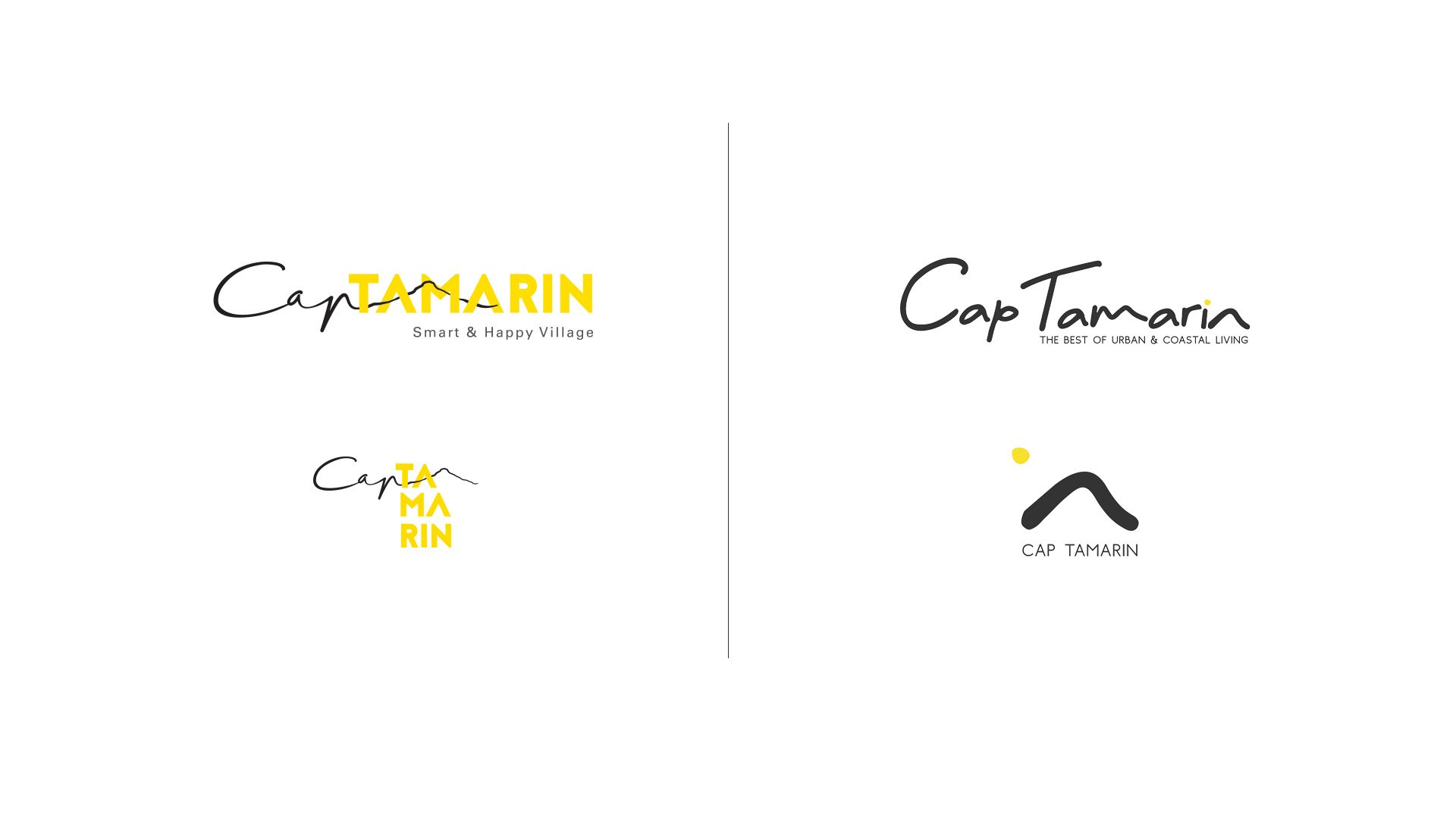
The objective was to move away from the existing “Smart & Happy Village” identity and establish Cap Tamarin as the place representing the best of urban and coastal living.
The brief focused on marketing strategy and social media direction, but the process revealed deeper brand challenges.
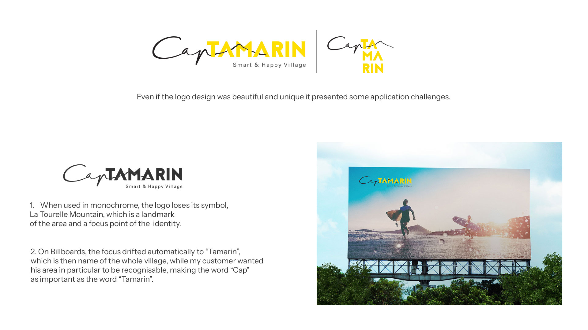
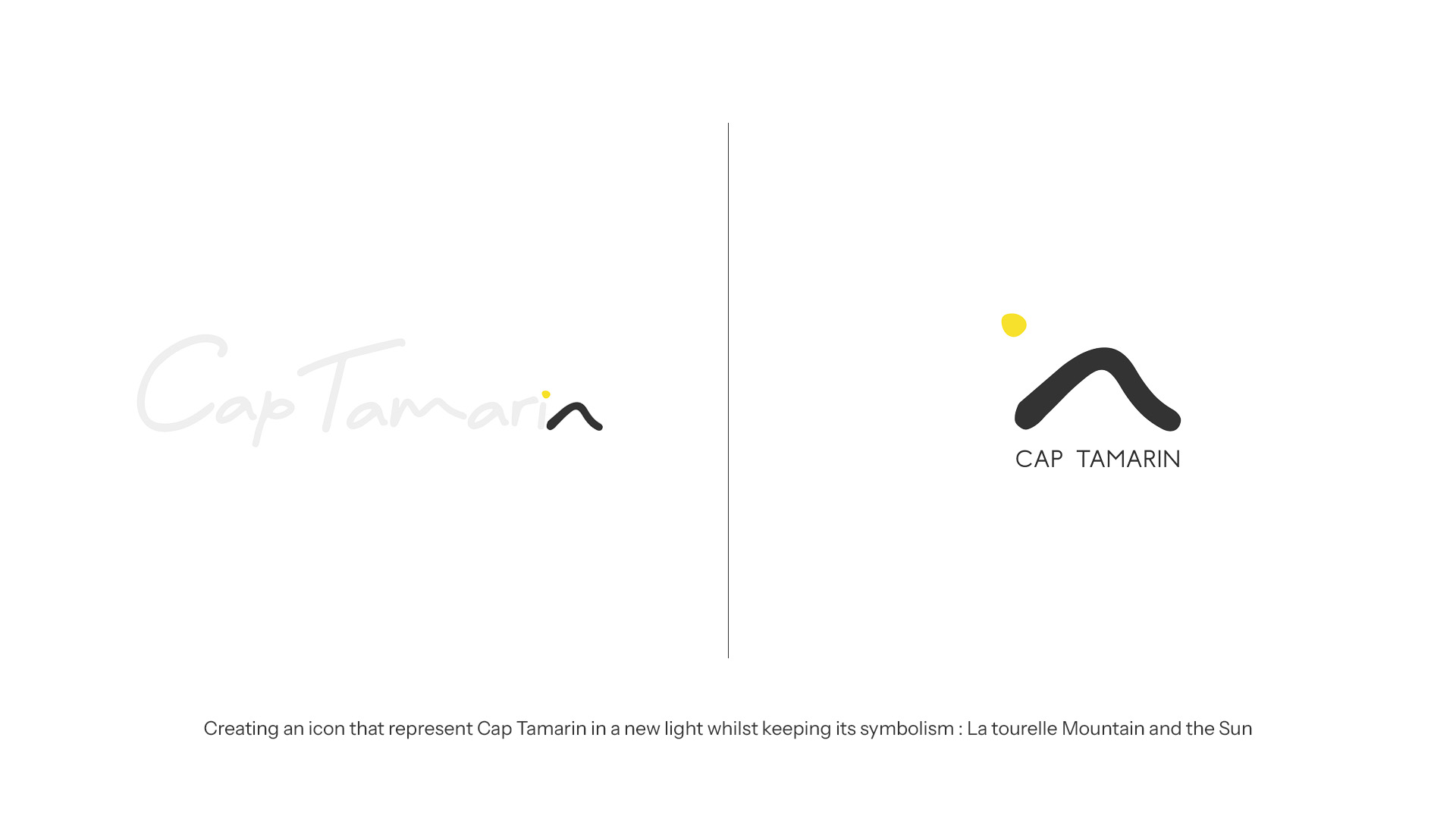
During the research phase, I noticed that the existing logo created practical challenges for the internal team.
The identity relied on overlapping elements that could not be reproduced in single-colour applications. This made the logo difficult to use across signage, print and digital formats, particularly when it appeared on non-white backgrounds.
Although this issue was not part of the original brief, it became clear that the problem affected the brand’s consistency and usability.
As part of the pitch presentation, I introduced a redesigned version of the logo alongside the marketing strategy.
The objective was to demonstrate how a simplified and structurally sound identity could support the new positioning and work consistently across all applications.
Presenting the solution during the pitch revealed an immediate reaction from the internal team, confirming that the usability issues were a known frustration.
Addressing this pain point helped differentiate my proposal from larger advertising agencies.
The proposal combined:
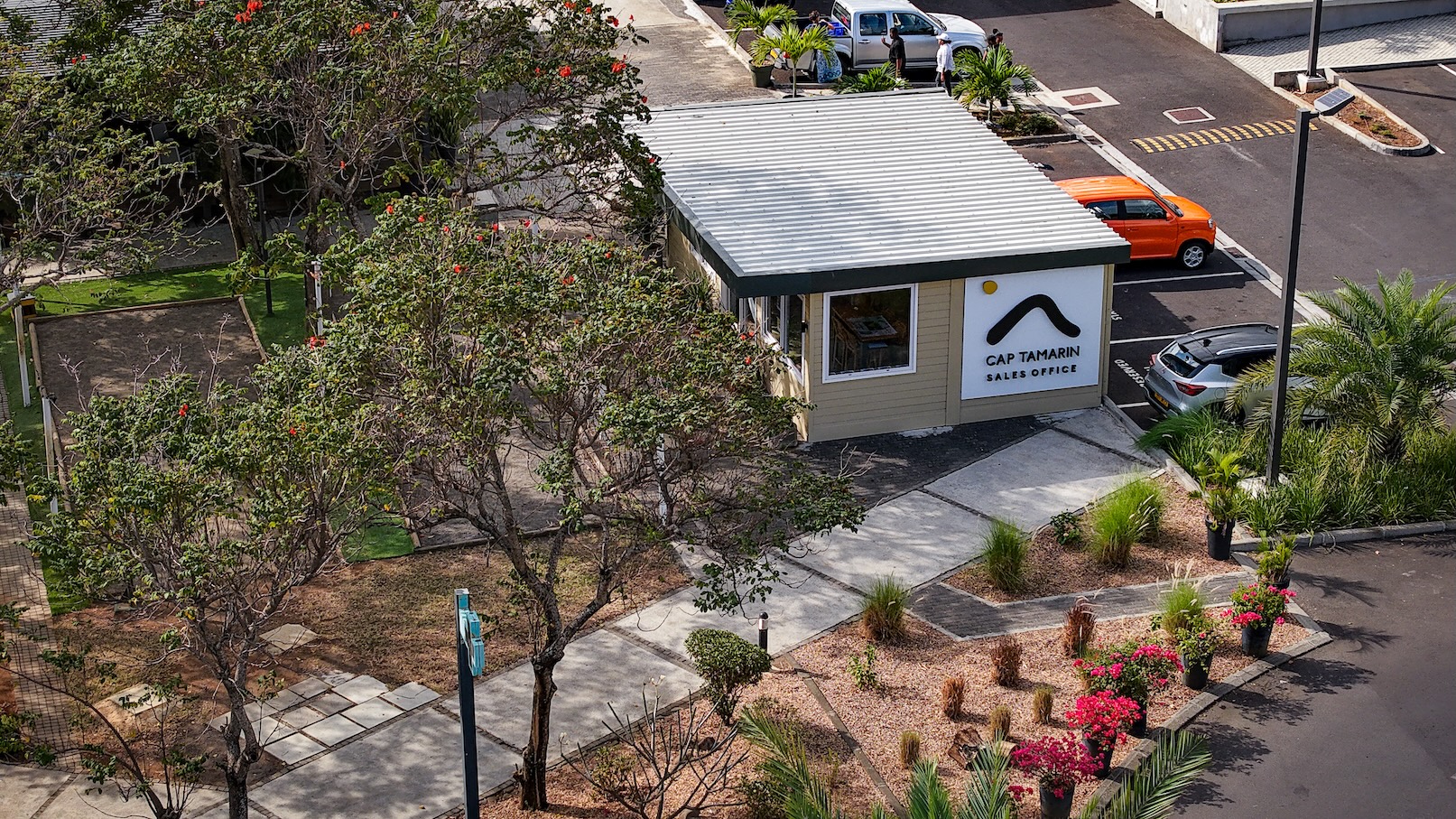
The project was awarded to me as a freelance designer, and the collaboration evolved into a long-term partnership.
Over the following two years, I became Cap Tamarin’s primary creative partner, responsible for maintaining and extending the brand across multiple touchpoints.
My work included:
This work required balancing strategic consistency with the practical realities of real estate marketing.
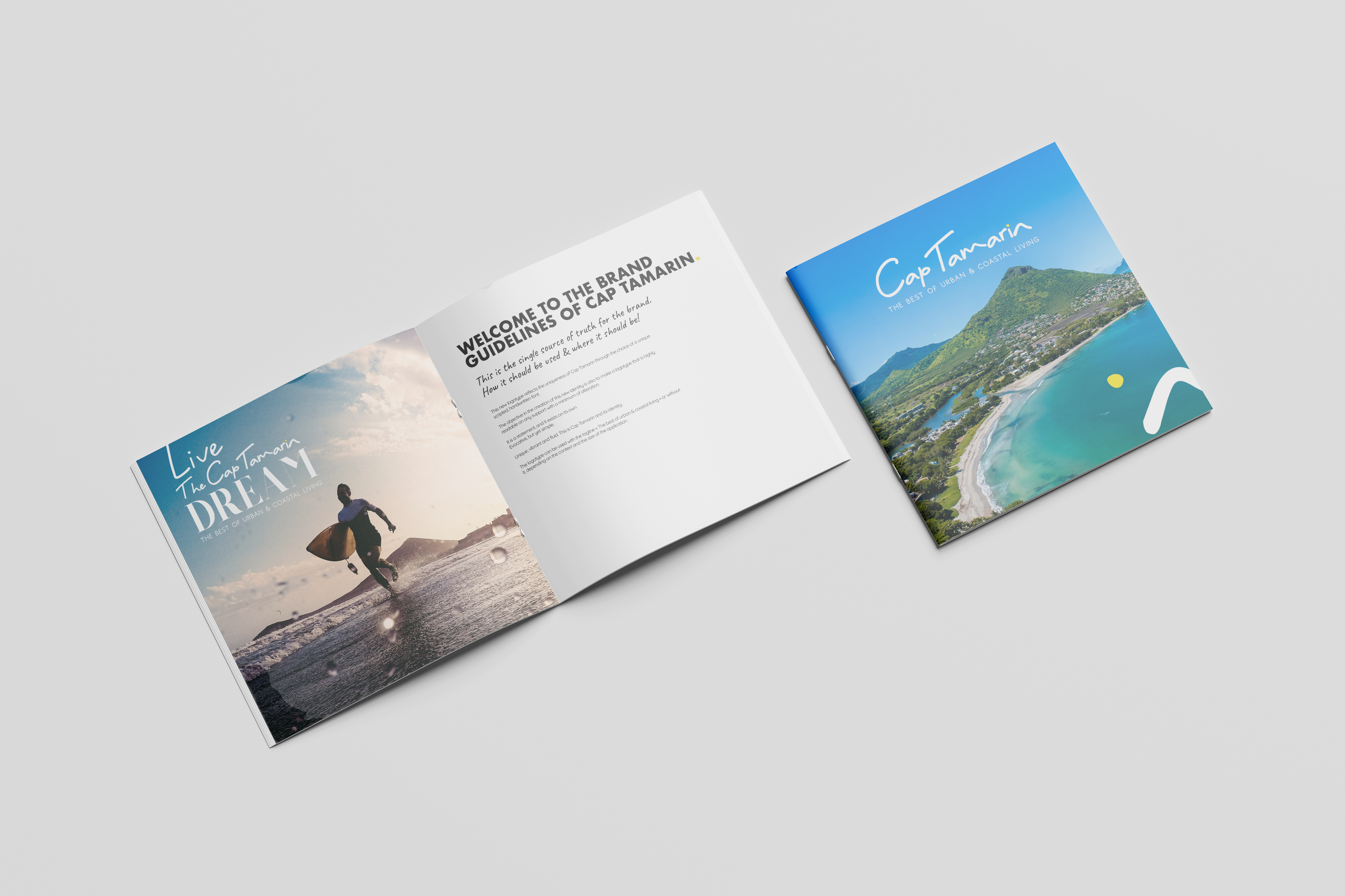
The repositioning helped strengthen Cap Tamarin’s brand recognition and supported the development’s marketing efforts over the following years.
More importantly, the redesigned identity provided a clear and scalable visual system that could support the growing ecosystem of projects within the development.